2018 New Taipei City Mayoral Candidate - Su Tseng-chang Election
2018 新北市市長候選人 — 蘇貞昌競選視覺識別系統
brand identity
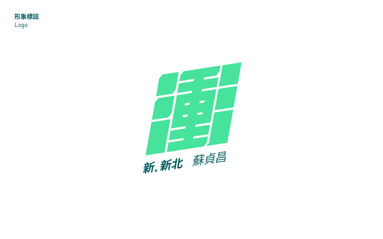
以「衝」、「電火球」及「閃電」作為此次競選識別的主要元素,這三個元素常被用來作為蘇貞昌先生的形象代表。
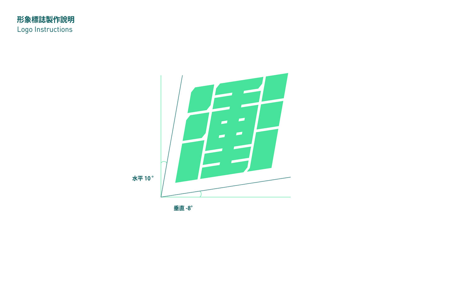
「衝」是這次的主視覺,「衝」的字體設計設定為黑體,以寬大的筆畫構成這個字,並將字腔設定的較為緊密,讓字體的量感充足,貫徹此套視覺的核心重點-力道,其次在筆畫中加入斜角,增加細節度與特徵性。最後再將衝勁和速度感以傾斜的方式來表現,而此套主視覺的傾斜設定為兩個維度的傾斜,而非一個維度,主要目的是讓速度感能更被強調,也讓字體的空間感更有變化,增加了這套視覺的辨識度。
色彩搭配上,競選團隊希望整體形象除了穩重、有幹勁之外,也能帶有年輕且多元的意象,因此我們使用較為現代感的綠色系並搭配多元的輔助色,使整體視覺能帶給民眾新穎、多元、突破過去框架的視覺感受。
The main elements of this campaign identity are "Charge," "Fireball," and "Lightning," which are often used to represent Mr. Su Tseng-chang's image.
The central visual theme, "Charge," features a bold font with wide strokes and tight letter spacing to convey strength. Angled corners add unique details, while the text’s two-dimensional slant expresses energy and speed. This design technique enhances the spatial dynamics of the font, further emphasizing the sense of movement and increasing the visual’s recognition.
For color pairing, the campaign team desired a visual that is not only stable and energetic but also carries a youthful and diverse impression. Therefore, we chose a modern green color palette complemented by various secondary colors. This approach aims to deliver a fresh, diverse, and innovative visual experience that breaks away from traditional frameworks.
client
visual design
year
二三設計
早起設計
2018


